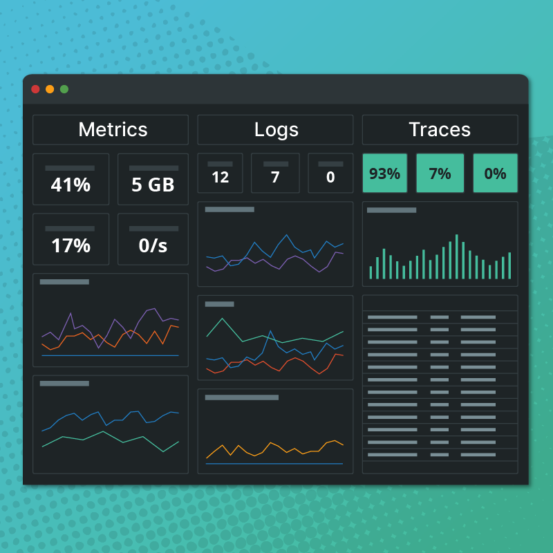
The USE method was developed by Brendan Gregg to study performance problems in a systematic way.1 It provides a simple, top-down approach to identify bottlenecks quickly and reliably. The gathering of performance metrics is usually done using a myriad of different system tools (sar, iostat, vmstat) and tracers (dtrace, perf, ebpf). Circonus has now added the most relevant USE metrics to its monitoring agent, and conveniently presents them in the form of a USE Dashboard (Figure 1, live demo), that allows a full USE analysis at a single glance.

Outline
- System Monitoring
- The USE Method
- Performance Metrics
3.1 CPU / Scheduler Monitoring
3.2 Memory Management
3.3 Network Monitoring
3.4 Disks and File Systems - The USE Dashboard
1. System Monitoring
System monitoring is concerned with monitoring basic system resources: CPU, Memory, Network and Disks. These computational resources are not consumed directly by the application. Instead, the Operating System abstracts and manages these resources and provides a consistent abstracted API to the application (“process environment”, system calls, etc). Figure 2 illustrates the high level architecture. A more detailed version can be found in Gregg.2, 3

Once critical objective of system monitoring is to check that if how the available resource are utilized. Typical questions are: Is my CPU fully utilized? Is my application running out of memory? Do we have enough disk capacity left?
While a fully utilized resource is an indication of a performance bottleneck, it might not be a problem at all. A fully utilized CPU means only that we are making good use of the system. It starts causing problems only when incoming requests start queuing up or producing errors, and hence the performance of the application is impacted. But queuing does not only occur in the application layer. Modern software stacks use queuing in all system components to improve performance and distribute load. The degree to which a resource has extra work that it can not service is called saturation,3, p42 and is another important indicator for performance bottlenecks.
2. The USE Method
The USE method, by Gregg, is an excellent way to identify performance problems quickly. It uses a top down approach to summarize the system resources, which ensures that every resource is covered. Other approaches suffer from a “street light syndrome,” in that the focus lies on parts of the system where metrics are readily available. In other cases, random changes are applied in the hope that the problems go away.
The USE method can be summarized as follows:
For each resource, check utilization, saturation, and errors.
The USE analysis is started by creating an exhaustive list of that are consumed by the application. The four resource types mentioned above are the most important ones, but there are more resources, like IO Bus, Memory Bus, and Network Controllers, that should be included in a thorough analysis. For each resource, errors should be investigated first, since they impact performance and might not be noticed immediately, when the failure is recoverable. Then, utilization and saturation are checked.
For more details about the use method and its application to system performance analysis the reader is referred to the excellent book by Gregg.3
3. Performance Metrics
It’s not immediately clear how utilization, saturation, and errors can be quantified for different system resources. Fortunately, Gregg has compiled a sensible list of indicators2 that are available on Linux systems. We have taken this list as our starting point to define a set of USE metrics for monitoring systems with Circonus. In this section, we will go over each of them and explain their significance.
3.1. CPU Monitoring
Utilization Metrics:

- cpu`idle — time spent in the idle thread and not waiting on I/O (yellow)
- cpu`wait_io — time spent in the idle thread while waiting on IO (dark yellow)
- cpu`user — time spent executing user code (blue)
- cpu`system + cpu`intr — time spent executing OS-kernel code (dark blue)
Those metrics should give you a rough idea of what the CPU is doing during the last reporting period (1M). Blues represent time that the system spent doing work, yellow colors represent time where that the system spent waiting.
Like all other monitoring tools we are aware of, the values are derived from `/proc/stat`.4 However, they should be taken with the necessary precaution:5, 6 Those counters do not usually add up to 100%, which is already bad sign. Also accounting takes place in units of full CPU time slices (jiffies) at time of the clock interrupt. There are many voluntary context switches within a single time slice that are missed this way. Tickless kernels and varying clock speeds (Intel Turbo Boost/Turbo Step) further blur the meaning of these metrics. For the subtleties in accounting wait_io on multiprocessor systems see A. Veithen.11
Nevertheless these metrics are used everywhere to measure CPU utilization, and have proven to be valuable first source of information. We hope that we will be able to replace them with more precise metrics in the future.
There are some differences from Gregg:2 There, `vmstat “us” + “sy” + “st”` is the suggested utilization metric. We account steal time (“st”) as idle.
Saturation Metrics:

- cpu`procs_runnable (normalized, corrected) — runnable processes per CPU (purple)
- loadavg`1 (normalized) — one-minute load average per CPU (dark purple)
- Saturation threshold guide at value one. (black)
The CPU keeps runnable processes waiting on a queue. The length of this queue at any given point in time is a good metric for the CPU saturation. Unfortunately, this number is not directly exposed by the kernel. Via `/proc/stat` we get the total number of runnable processes (`procs_running`) which includes queued processes as well as currently running processes. We report this number as the `procs_runnable` metric. While being a straightforward measure, it suffers from the low sampling interval (only once a minute) and an observation bias. The Circonus agent NAD currently lists 3 running processes for an idle system. We account for these problems by (a) subtracting processes run by the monitoring agent (3) and (b) dividing by the number of CPU cores on the system. In this way, a value of one, which is marked with the guide, represents a system that has one runnable process per core.
The load average is a smoothed out version of procs`runnable metric maintained by the kernel. It’s typically sampled every 5 seconds and aggregated exponential smoothing algorithm.7 Recent kernel versions spent a lot of effort to maintain a meaningful load average metric across a system with a high number of CPUs and tickless kernels. This metric is divided by the number of CPU cores as well.
While 1min, 5min, and 15min load averages are maintained by the kernel, we only show the 1min average, since the others don’t provide any added value when plotted over time.
Both collected metrics are similar in their interpretation. If the value of either of these is larger than one (the guide) you have processes queuing for CPU time on the machine.
Differences from Gregg:2 In Gregg’s method, only procs_runnable statistic is considered. We think load averages are valuable as well.
Error Metrics:
CPU error metrics are hard to come by. If CPU performance counters are available (often not the case on virtualized hardware) perf(1) can be used to read them out. At the moment, Circonus does not provide CPU error metrics.
3.2. Memory Management
This section is concerned with the memory capacity resource. The bandwidth of the memory interconnect is another resource that can be worth analyzing, but it is much harder to get.
Utilization Metrics:

- vm`meminfo`Buffers — file system buffers (darker yellow)
- vm`meminfo`Cached — file-system caches (dark yellow)
- vm`meminfo`MemFree — free memory (yellow)
- vm`meminfo`Used (computed) — memory used by the application (blue)
The OS uses memory that is not utilized by the application for caching file system content. These memory pages can be reclaimed by the application as needed, and are usually not a problem for system performance.
Saturation Metrics:

- vm`info`pg_scan — the number of memory pages scanned per second (purple)
- vm`swap`used — usage of swap devices (purple, zero in the example)
When the free memory is close to exhausted, the system begins freeing memory from buffers and caches, or begins moving pages to a swap partition on disk (if present). The page scanner is responsible for identifying suitable memory pages to free. Hence, scanning activity is an indicator for memory saturation. A growing amount of swap space is also an indicator for saturated memory.
When the system has neither memory nor swap space left, it must free memory by force. Linux does this by killing applications that consume too much memory. When this happens, we have an OOM-(“out of memory”)-event, which is logged to dmesg.
Differences from Gregg:2 We are missing metrics for swapping (i.e. anonymous paging) and OOM events.
Errors:
Physical memory failures are logged to dmesg. Failed malloc(3) can be detected using SystemTap. We don’t have any metrics for either of them at the moment.
3.3. Network Monitoring
Utilization Metrics:

- if`<interface>`in_bytes — inbound network throughput in bytes/sec
- if`<interface>`out_bytes — outbound network throughput in bytes/sec
The network utilization can be measured as throughput divided by the bandwidth (maximal throughput) of each network interface. A full-duplex interface is fully utilized if either inbound or outbound throughput exhaust the available bandwidth. For half-duplex interfaces, the sum of inbound and outbound throughput is the relevant metric to consider.
For graphing throughput we use a logarithmic scale, so that a few kb/sec remain visibly distinct from the x-axis, and set the y-limit to the available bandwidth. The available bandwidth is often not exposed by virtual hardware; in this case, we don’t set a y-limit.
Saturation Metrics:

- tcp`setments_retransmitted (purple)
- if`<interface>`{in,out}_drop — dropped packets due to full buffers (purple, zero)
- if`<interface>`{in,out}_fifo_overrun — dropped packets due to full buffers (purple, zero)
Network saturation is hard to come by. Ideally, we’d like to know how many packets are queued send/receive buffers, but these statistics do not seem to be exposed via /proc. Instead, we have to settle for indirect indicators which are available, such as tcp-level retransmits, as well as drop and overrun counts.
Error Metrics:
- if`<interface>`{in,out}_errors — the number of errors occurred, e.g. invalid packets received
All metrics covered in this whole section should be taken with a great bit of caution. The Linux networking stack is a large, undocumented codebase with a lot of known bugs in the accounting mechanisms, see Damato.8.
3.4. Disks and File Systems
Utilization Metrics:

- diskstats`<device>`io_ms — the percentage of time the device has been utilized during the last reporting interval
The disk utilization is measured per device and not per file system. We simply record the percentage of time the device was busy during the last reporting period. This metric is read from `/proc/diskstats`.
Saturation Metrics:

- diskstats`<disks>`io_ms_weighted — Average number of inflight I/O operations
This metric is exposed under the name “avgqu-sz” by `sar -d` and `iostat -x` and measures the number of requests that are currently queued or processed by the disk. The metric is derived from a weighted_io_ms counter in `/proc/diskstats`, and involves a little bit of mathematics.11
Error Metrics:
According to Gregg,2 disk errors can be found in /sys/devices/<>/ioerr_cnt, smartctl, or by “tracing of the IO subsystem”. However in the (virtualized) systems we used for testing, these metrics were not exposed. Hence, at the moment, we don’t include any disk error metrics.
4. The USE Dashboards
The USE Dashboard, shown in Figure 1 above, combines all metrics discussed above in a single dashboard for each host.
Each row corresponds to a resource type, and each column contains an analysis dimension: Utilization, Saturation, and Errors. To perform a USE Performance analysis as outlined in Gregg,1, 2 you would traverse the dashboard line by line, and check:
- If errors are present? => Graphs in Column 3 non zero.
- If saturation is present? => Graphs in Column 2 show large values over extended time period
- Is the resource is fully utilized? => Graphs in Column 1 are maxed out.
The graphs are organized in such a way that all these checks can be done at a single glance.
Discussion
The USE Dashboard allows a rapid performance analysis of a single host. Instead of ssh-ing into a host and collecting statistics from a number of system tools (vmstat, iostat, sar), we get all relevant numbers together with their historical context in a single dashboard. We found this visualization valuable to judge the utilization of our own infrastructure, and as a first go-to source for analyzing performance problems.
However, the work on this dashboard is far from complete. First, we are lacking error metrics for CPU, Memory, and Disk resources. We have included text notes on how to get them manually in the USE dashboard to make those blind spots “known unknowns”. Another big working site is the quality of the measurements. As explained above, even basic metrics like CPU utilization have large margins of errors and conceptual weaknesses in the measurement methodology. Also, we did not cover all resources that a system provides to the application. E.g. we don’t have metrics about the File System, Network Controllers, I/O- and Memory- interconnects, and even basic metrics about the physical CPU and Memory resources are missing (Instruction per sec, Memory ECC events). Figure 3 below positions the covered resources into the high level system overview presented in the introduction.

Try it yourself!
To try the USE Dashboard for yourself, log into your Circonus account, click on “Checks” > “+ New Host” to provision a new host with a single command. The USE Dashboard will be automatically created. A link is provided at the command line.
No Circonus account, yet? Get one for free here.
References
- Gregg – Thinking Methodically about Performance, CACM 2013
- Gregg – Use Method: Linux Performance Checklist
- Gregg – Systems Performance, Prentice Hall 2014
- https://www.kernel.org/doc/Documentation/filesystems/proc.txt
- https://github.com/torvalds/linux/blob/master/Documentation/admin-guide/cpu-load.rst
- Gregg – Broken Linux Performance Tools, Scale14x (2016)
- https://en.wikipedia.org/wiki/Load_(computing)
- Damato – All of your network monitoring is probably wrong
- Hartmann – Monitoring Queue Sizes
- https://github.com/iovisor/bcc
- Andreas Veithen – The precise meaning of IO wait on Linux (blog)