Today, the Circonus team is releasing the first round of our new User Interface changes.
Since we started developing Circonus 7 years ago, we’ve worked with many customers in different spaces with different needs. Our team talked with many engineers about how they monitor their systems, what their workflow looks like, and the configuration of their ideal platform. You’ve spoken and we listened. Now, we’ve put those years of feedback to use, so that you get the benefit of that collective knowledge, with a new, improved interface for managing your monitoring.
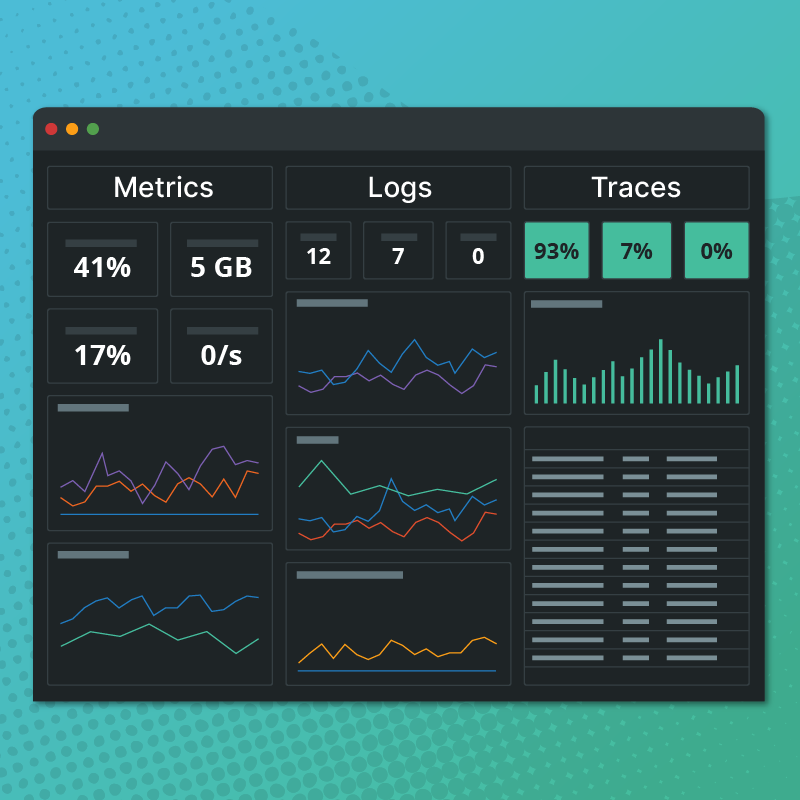
The interface now features responsive improvements for different screen sizes (and which provides better support for mobile devices) and a revised navigation menu. More changes will follow, as we innovate to adapt our interface to intuitively suit our users needs.

Frequently Asked Questions
Change, even change for the better, can be frustrating. This FAQ will help explain the interface changes. We’ll be adding more items to this FAQ as we get more feedback.
Where did the checks go?
The checks have been moved to under the “Integrations” menu.

Where did the graphs go?
Graphs are now under the “Analytics” menu.

Where are the rulesets?
Rulesets can be found under the “Alerts” menu.

Send us your feedback
Tell us about your own Circonus experience, and let us know what you think about our new User Interface:
- Take our survey about the UI changes.
- Write in to [email protected].
- Join our slack channel and be part of the dialog at slack.s.circonus.com.