Circonus has released several new features and enhancements that revolutionize visibility into your infrastructure’s performance. Let’s explore each of these exciting updates.
Circonus Unified Agent
We would like to formally announce Circonus Unified Agent, which we affectionately refer to as CUA [see-you-ey]. By installing CUA, Circonus customers can collect telemetry data from over 300 different technologies — but the list is ever-growing. We continue to expand CUA support by regularly adding input plugins for additional systems, services, and 3rd party APIs. What’s more, CUA is open-source, so customers can fork CUA and build on it as needed. CUA input plugins are designed to be easy to develop and contribute, and pull requests are always welcome.

For a full list of the integrations supported by Circonus, check out Circonus Docs.
OpenTelemetry Support
Circonus has also introduced support for OpenTelemetry (OTel), an open-source observability framework that enables the collection of telemetry data using industry-standard APIs. Circonus customers can now use open telemetry integrations within their platform to submit data natively to the Circonus Broker. As an added benefit, Circonus can adapt OpenTelemetry Histograms into OpenHistogram format during data ingestion.
In case you missed the announcement of OpenHistogram last year, Circonus released its powerful open-source histogram technology under this name. OpenHistogram’s patented technique for determining optimal histogram bin sizes results in superior performance, accuracy, correctness, and usability. Learn more at https://openhistogram.io/
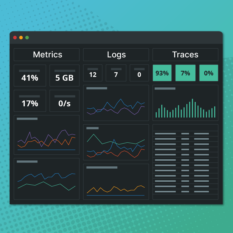
Enhanced Metrics Explorer
The Metrics Explorer has traditionally helped customers find and view their telemetry data within the Circonus platform. We’re now proud to announce several updates that improve metric selection, manipulation, and visualization. We’ve also added support for two powerful workflows.
Layout
When you visit the enhanced Metrics Explorer, you’ll first notice an updated two-column layout. On the left, in the “Select” column, is where you will enter one or more queries to find and manipulate various metrics. On the right, in the “View” column, is where you will review the metrics you have surfaced.

Multiple Queries
Within the “Select” column, you can now apply multiple queries by clicking the “Add Query” button. Queries are named alphabetically, i.e. Query A, Query B, Query C, etc. When you view the individual metrics resulting from more than one query or you view visualizations grouped by query, the associated queries will be labeled.

CAQL Queries
In addition to standard searches within Metrics Explorer, you can now conduct queries that leverage Circonus Analytics Query Language (CAQL). CAQL supports the advanced selection and aggregation of metrics as well as complex data transformations.

In the future, we plan to enhance the experience of building a CAQL query by adding syntax highlighting and integrated documentation as well as error detection.
Visualizations
Now, after you perform a search in Metrics Explorer, you have two choices for viewing the results. The default view is a list, with each metric stream listed separately and labeled with its corresponding query. When possible, each list result will also display a sparkline reflecting the shape of the data. List results can be sorted alphabetically by metric name, host name, or check name.

For a more visual representation, click on the new Visualizations tab. Here you can view your results within one or more graphs. The dropdown within the tab lets you configure how you’d like to see the visualizations. By default, one visualization will be shown for the totality of the search. However, you can also select to show one visualization per query or one visualization per given tag value. Should you select the latter, you will need to provide the desired tag category.
Saving Visualizations
Perhaps the most useful feature we added to the Metrics Explorer is the ability to take your visualizations and either save them as a graph or add them to a dashboard.
After a search has been performed, you can access both of these options from the Visualizations tab. Here, each visualization will display two buttons in its upper right corner: “Save as Graph” and “Add to Dashboard.”

To save a visualization as a graph, simply give it a name.

To add a visualization to a dashboard, you’ll need to decide whether you’d like to place it on an existing dashboard or create a new dashboard on which to place it. For an existing dashboard, simply start typing its name and a series of suggestions will appear from which you can choose. Once you have chosen your dashboard’s name, use the adjacent dropdown to select the desired dashboard tab. For a new dashboard, simply enter a dashboard name. Remember that you can always change the name of your dashboard (and any of its tabs) later on.

Additional Service Dashboards
We have also produced a variety of new service dashboards which are created automatically when the given integration is installed. As a reminder, all of our integrations marked “Premium” include these turnkey service dashboards. Most recently, we added service dashboards for Apache, Docker, and services within the Google Cloud Platform (GCP).
Apache
Our Apache integration checks the status of a single Apache server.

Docker
Our Docker integration can check the status of almost any Docker installation — either self-hosted or in a cloud environment.

GCP
Once you’ve set up GCP access for the Circonus Unified Agent (CUA), our integration will automatically pull data from the Google Cloud services you’re using without the need for additional configuration. Service dashboards are provided for twelve commonly used GCP services: BigQuery, Compute Engine, Firewall Insights, Load Balancing, Logging, Network Topology, Cloud Armor, Cloud Router, Cloud APIs, Cloud Storage, and Cloud VPN.


Custom Dashboard Improvements
We’ve added support for rendering text and histogram data within the graphs on our custom dashboards. This allows more customers to take advantage of the ~90% boost in performance offered by the new custom dashboard rendering libraries. As we add more widgets and other upgrades, we will work towards complete deprecation of our legacy dashboards so that everyone can enjoy the performance improvement.
Another addition to our custom dashboards is variables. By leveraging variables, custom dashboards can display dropdowns of tags, hosts, or other infrastructure elements. These dropdowns, which display above the actual visualizations, provide an easy and powerful way to explore your infrastructure without the need to create dozens of dashboards.
More Coming Soon
We’re continuing to make improvements to Metrics Explorer as well as our custom dashboards, among other exciting enhancements to the platform. If you have any feedback or questions, don’t hesitate to reach out to us.