Circonus combines simplicity and power to give customers sophisticated and flexible analytics. Real-time intelligence combines with robust historical analysis to provide the accurate, in-depth insights required to ensure the reliability of your revenue-generating services.
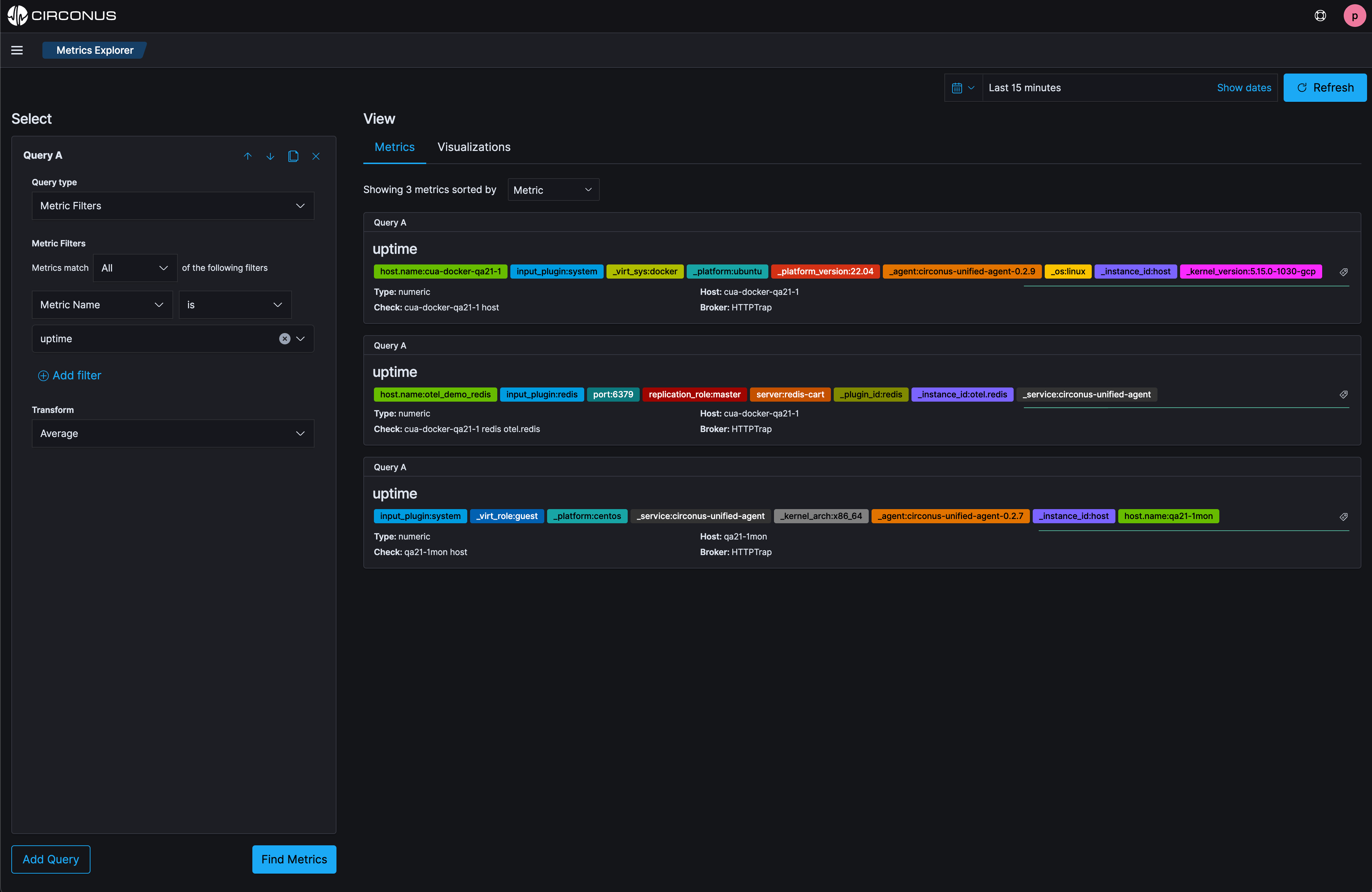
Easily view all metrics with Metrics Explorer
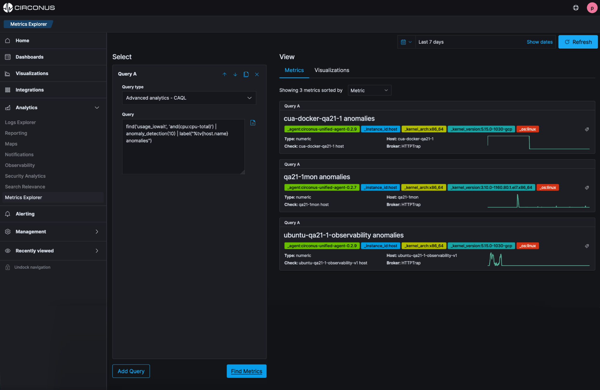
Instantly identify anomalies
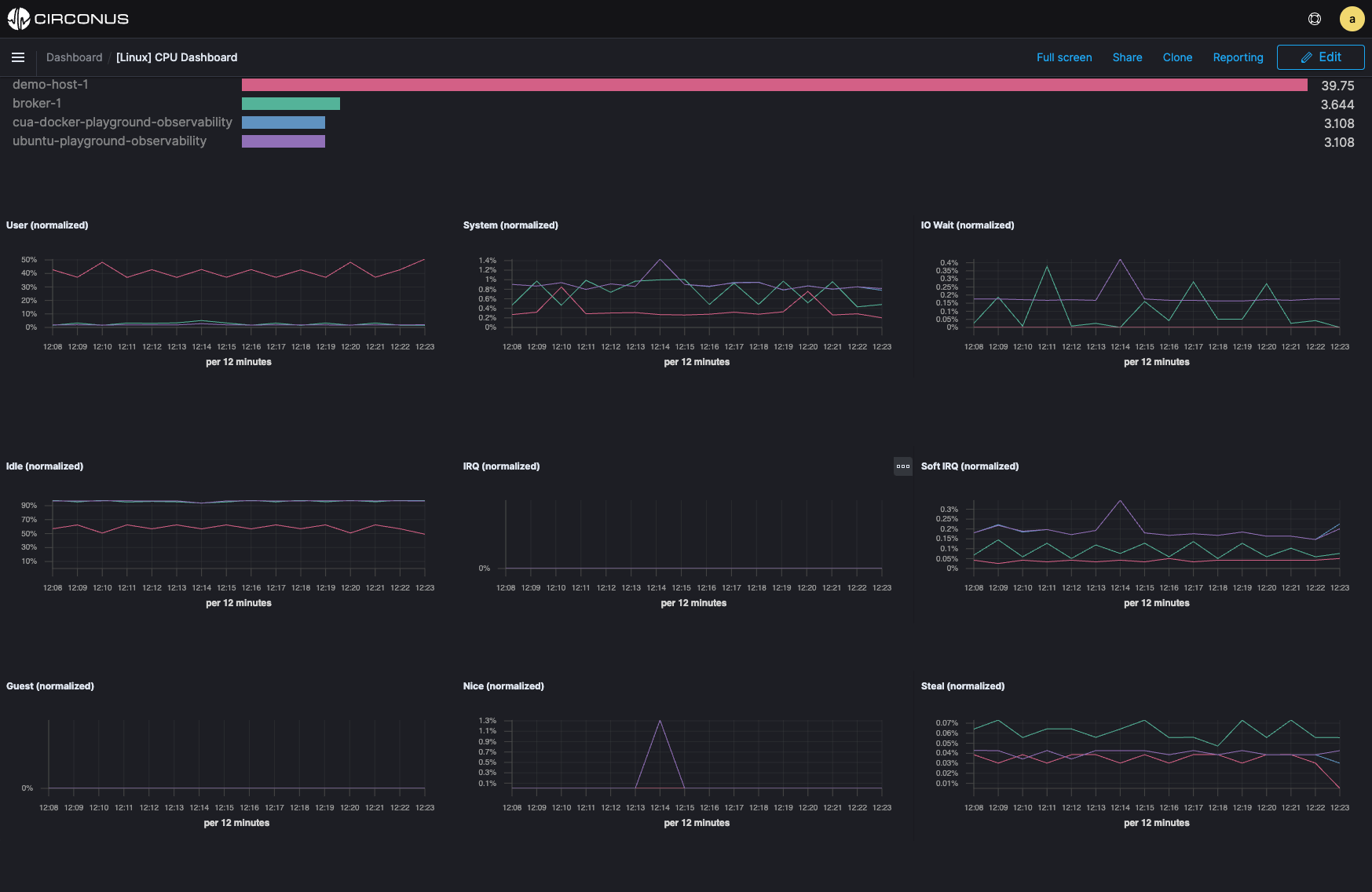
Proactively optimize using advanced insights
How SREs Can Achieve More Success by Implementing Modern Monitoring

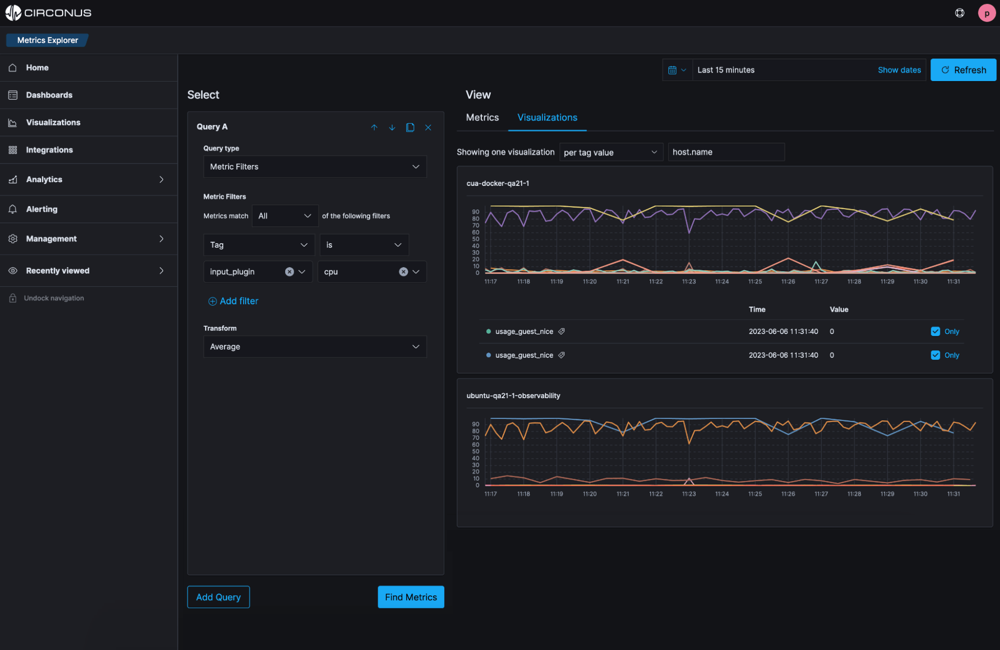
Know what’s happening in real time
Pinpoint issues immediately
Our customers have zero tolerance for latency, and any second of downtime is money lost in terms of time and productivity. We were able to leverage Circonus to assess and analyze our service delivery, helping Flickr deliver photos about 25% faster today than it did last year.
Don MacAskill, CEO
Smugmug