
White Paper
Assuring Service Quality in the Age of Microservices
by Theo Schlossnagle
Customer experience may be the last frontier of competitive advantage for online businesses. If you can’t find ways to up your game, your competitors will wrest market share from you. Your IT infrastructure may hold the key to staying ahead of the pack. First, you must accurately measure IT metrics over time to uncover hidden value. Knowing where to focus efforts helps you improve service quality.
The emergence of microservices has changed user expectations. Microservices offer flexibility, speed and scale as a software development architecture. Yet, each microservice has its own language, interdependencies, and APIs. Thus, the number of metrics you should be measuring increases dramatically. The key to improving service quality could lie in any of those metrics.
In this post, you’ll learn how to:
- Avoid inefficiencies in calculating service levels
- Calculate current service levels accurately
- Use histograms to expand the metrics you collect for more accurate results

Introduction
Assuring Service Quality is a common goal of all online businesses, from media companies to cloud-based service providers. The continued success of these businesses depends on ensuring that their customers have the best possible online experience, every time. Keeping service quality high requires situational awareness – monitoring service levels so you can act to minimize events that negatively impact the user experience. However, whether you provide video on-demand, web conferencing, e-commerce transactions, or any other service, the age of microservices has changed user expectations. A complete picture of their experience extends all the way down to the individual microservices that compose critical business service delivery.
To properly calculate service levels you need to monitor overall service delivery and also individual microservices, but the volume of data involved poses an interesting technical challenge. There are three ways to handle this.
The Inefficient Way to Calculate Service Levels
Calculating service levels can require a lot of data. You could build your own Hadoop-type instance to store all that data, but anyone who has done this knows how costly it is to actually process data at scale and how costly it can become as the amount of data increases.
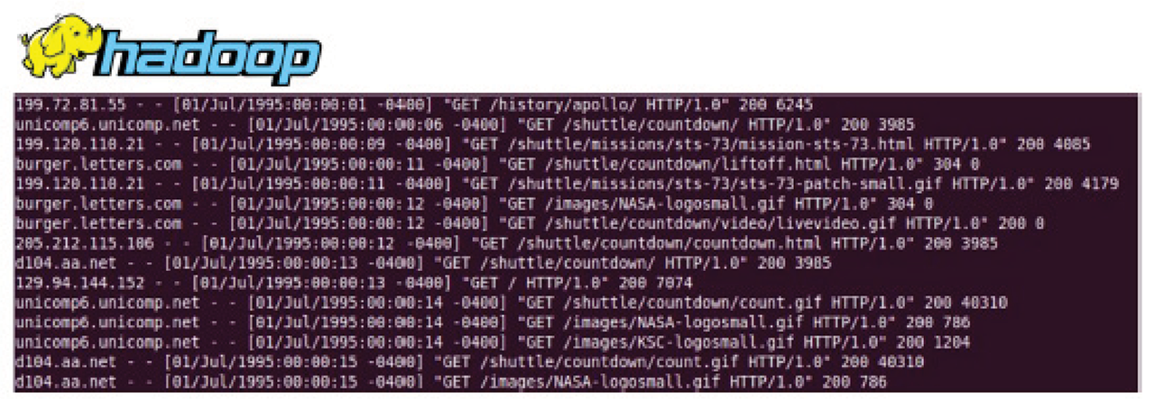
Figure 1: An example of classical log processing where logs are put on HDFS, and then batch jobs run across them
The Inaccurate Way to Calculate Service Levels
Traditional tools can present an inaccurate picture of your service levels because they are not working with all the data. Typically, historical data is rolled up and averaged, if it’s kept at all. Like most existing monitoring tools, Cacti leverages RRD for storing time series data. In the screenshot in Figure 2, you can see by default it stores only the average of any number of measurements taken over the preceding minute. After 1 hour, the RRD file only stores averages of those averages. A month later, the single data point stored in the tool is the result of 3 rounds of aggregation (averaging of averages). The only value provided by such a number is filling in a point on a graph. The graph itself yields no useful insight into service latencies.
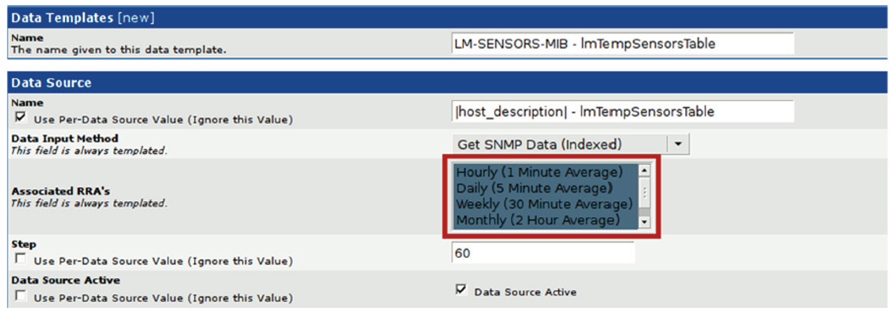
Figure 2: A screenshot from Cacti (Cacti is a registered trademark of The Cacti Group, Inc.)
In this scenario, service level calculations end up being just estimations – often wrong estimations. For example, if you capture the 95th percentile of request latencies on each of the nodes of a db cluster, how do you measure the 95th percentile of all requests to the db service? Hint: It is not the average of the measured percentiles!
Instead of using the average, you need to capture more data to derive the service-level percentile. To calculate a percentile over varying time windows, you need all of the original, unsummarized measurements for the given time frame. If you add together the 95th percentile of two successive 5-min time windows and divide by two, you will get a different result than calculating the 95th percentile over the 10-min window.
The Circonus Way: Calculating Service Levels with Histograms
At one time, averaging percentiles may have been “good enough” for monolith application relying on the existing tools. Not anymore – not in the new world of proliferating microservices. Within this new world, what’s needed is a flexible measurement tool that can handle the large volume of data required for accurate results. That tool is possible thanks to the Histogram.
Histogram metrics provide a true representational view of service levels, from overall trending to those important outliers that you would never see with averaged and rolled-up data. Being able to figure out when outliers become a problem is critical to measuring latency. In the cloud era, “slow” (latency) is the new “down.” When it comes to monitoring the exploding microservices that more and more companies are relying on to run their businesses, better understanding is required. Histograms and statistical tools are the only pragmatic path forward.
What do we mean by histograms? You might be familiar with the following representation of histograms as two-dimensional bar plots that indicate the frequency of collected data in certain bins of the definition range.
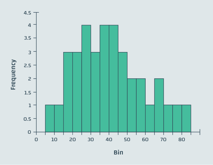
Figure 3: Example histogram, a simple bar chart
However, histograms have a more flexible range of applications than this simple representation may suggest. Where traditional tools roll up data by averaging it, losing the actual data, we can instead place data into the bins of a histogram. Within a bin, the order in which the measurements occurred is lost, but in exchange we gain incredible efficiency compared to storing every measurement, without sacrificing accuracy in the manner of the traditional tools. This methodology is not only data-efficient and cost-effective, it also combines well with sophisticated analytics tools, as we shall demonstrate.
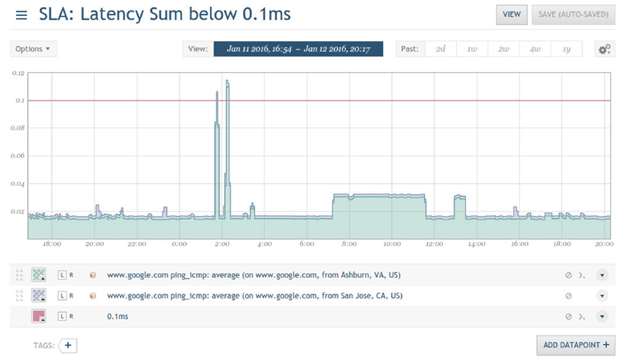
Figure 4: A screenshot from Circonus with a graph tracking latency. The red line indicates the 0.1ms limit required by the SLA.
How much more efficient are histograms? Precise numerical comparisons vary depending on the distribution of data and compression techniques, but the following calculation reasonably depicts the relative efficiency of storing latency measurements in Circonus versus existing monitoring tools that store time series data by means other than histograms.
Traditional Metric Storage: 1MM measurements = 1MM * 4 bytes = 4 Mb
Circonus: 1 Histogram ~ 100 bins = 100 * 4 byte * 2 = 800 bytes < 1 kb
Histograms aren’t just more efficient at storing data, they are also far more effective at presenting valuable information. In order to use histograms to monitor service levels, first we need to add the time dimension into the visualization. Circonus uses color (or more specifically, saturation) to replace the height information. The following figures will demonstrate:
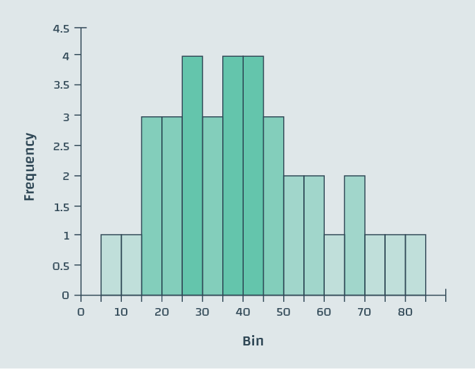
Figure 5: The histogram from figure 3, with color saturation based on the frequency axis
In the figure above, the frequency information is encoded twice – in the height of the bars, as well as in their depth of color. In the next step, we eliminate the use of height completely and arrive at the following “sparkline” representation of the data:

Figure 6: This sparkline shows 2 axes of information in a one-dimensional line
The next step is to use these one-dimensional sparklines to create a two-dimensional heat-map. We incorporate the time dimension by rotating the sparkline by 90 degrees and appending multiple sparkline histograms that were recorded over time along the x-axis. In this way, we get a heat-map that encodes the changes in the latency distribution over time.
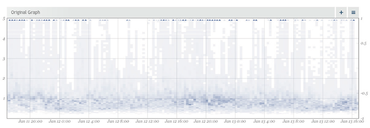
Figure 7: A histogram of a metric visualized in Circonus as a heatmap
Adding analytics tools on top of histograms helps you understand the value of the data being collected. Circonus analytics applied to histograms allows users to translate metrics to business value. In addition to setting thresholds for KPIs, like operations per second on database servers for example, the analytics tools of Circonus provide visibility into the performance, or quality, of the database services.
“At Amazon, SLAs are expressed and measured at 99.9th percentile of the distribution. The choice for 99.9% over an even higher percentile has been made based on a cost-benefit analysis. Experiences with Amazon’s production systems have shown that this approach provides a better overall experience compared to those systems that meet SLAs defined based on the mean or median.”
– Werner Vogles, Amazon CTO Amazon’s Dynamo, October 2nd, 2007
What is your database service latency at the 99.9th percentile over a 1 min time window? Circonus can answer that question – or any other percentile SLA optimized for your business needs – instantaneously and cost-effectively. Such capabilities provide the next level of operational intelligence that can be correlated with business KPIs, and help you make better decisions that impact the business’s bottom line.
Traditional monitoring tools utilize averages that do not paint a clear picture of what’s actually happening with KPIs. In contrast, histograms provide a way to efficiently represent every data point for a given metric and provide the numerical foundation for sophisticated analytics. Math and statistics work, and they allow our algorithms the ability to process massive amounts of data and provide you with the situational awareness required to be successful.
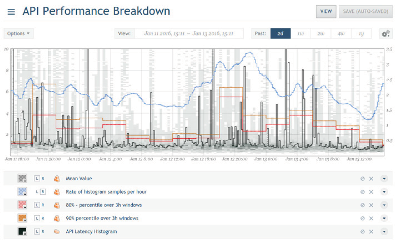
Figure 8: This API performance breakdown shows multiple Circonus analytics overlays, to help make sense of the underlying API latency histogram.
Circonus is the only monitoring platform to use histograms to store, process, analyze, and alert on massive amounts of data efficiently and cost-effectively. Circonus helps ensure that you are meeting your latency-based SLAs, and does it all with a solution that’s orders of magnitude better than “good enough.”
Monitoring microservice latencies is a perfect application for histograms. Histograms provide the necessary visibility for operations and application teams to identify and diagnose problems in a distributed, service oriented environment. The traditional “up/down” view of the world isn’t helpful at a time when end-user experience has replaced uptime as the primary focus of service delivery teams. Efficient collection and analysis of latency data via histograms enables you to measure and monitor what truly matters — all of the latencies that add up to your customer’s perception of service quality.