Over the past few months, we’ve been working on some major updates to Circonus — a new dashboard builder and interface along with several turnkey service dashboards. In the following post, we’ll share the motivation and process behind this project, then walk you through what you can expect.
Our Motivation
Circonus has provided the ability to create custom drag and drop dashboards for some time. However, this feature was added several years ago.
With a redesign, we hoped to provide a modern, responsive aesthetic as well as a superior user experience. Modernized dashboards would more effectively visualize key metrics, empowering users to quickly assess and act upon critical issues, and these visualizations would render well on a variety of devices and screen sizes. Additionally, dashboards would be significantly quicker and easier to create. Dashboards that used to take several days to create could be assembled in a fraction of the time.
Lastly, we realized that we needed to provide more turnkey service dashboards for our customers. Service dashboards are those that automatically appear when a user configures a particular check type or integration. This gives users instant insight into the new metrics they’re collecting. With a user-friendly dashboard builder, we could create service dashboards with ease and in turn, improve the entire product experience.
Our Process
The process of redesigning our dashboard builder and interface involved a number of essential steps, each of which was executed by various members of our UI/UX team.
Industry research
The first step in redesigning our dashboard builder involved competitive analysis as well as research of related, industry-adjacent tools. In this effort, we amassed a huge library of screenshots and took note of features comprising the most intuitive user experiences.
Feature List
Following thorough research, we began listing out desired features of our new dashboard builder and interface. For instance, users would need to edit the dashboard title, add sections and widgets, rearrange widgets across sections, and so forth. With a comprehensive list of features before us, the project began to take shape.
Mockups
Referencing our list of features, we began producing high-fidelity mockups. These mockups reflected various stages and modals within the dashboard building process. For instance, we created a mockup of the dashboard builder when empty, one after the user clicked the “Add section” button, one once a section layout was selected and inserted, and so forth.
Once complete, these mockups were presented to the Circonus team and a few of our customers, effectively walking them through the new user experience. The overall reception was positive, though we did collect constructive feedback that helped push the mockups over the finish line.
Implementation Strategy and Timeline
With the mockups finalized, we could develop an implementation strategy and timeline. We reflected on our feature list and divided features into essential (“must-have”) and optional (“nice-to-have”) buckets. Everything in the essential bucket would be included in the initial version. Features in the optional bucket would be addressed with subsequent improvements.
One notable element of our strategy was our decision to first use the new builder for developing system or service dashboards. These dashboards would be available to the user when they set up a given check type or integration. For instance, if a user began collecting metrics from their Nginx server instance, they would receive the Circonus Nginx dashboard. This strategy would not only enable us to smooth out any issues with the new dashboard builder and UI before releasing it to users, but it would give users greater visibility into their metrics as soon as possible.
With the scope and strategy decided upon, we drafted an implementation timeline. For each step, we added the estimated time allotment and tentative assignee(s).
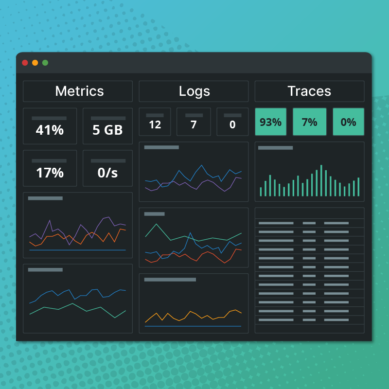
How The Dashboard Builder Works
The initial version of the dashboard builder is now complete. Here’s a brief overview of what to expect.
Once a new dashboard is created, the user enters “edit mode.” In edit mode, the user is isolated from the rest of the app so they can better focus on building out their dashboard.
One of the first features you’ll notice within the dashboard builder is tabs. By default, all new dashboards have a single tab. However, by clicking the “+” icon in the tab bar, the user can add additional tabs to better organize their dashboard visualizations. Once tabs are added, they can be renamed, rearranged, cloned, and deleted. Cloned tabs will conveniently copy over all of their existing sections and widgets.

Clicking the “Add section” button in the top right lets the user choose from a variety of section layouts. Each section is essentially a row with a given number and size of columns. Once a section is added, it can be deleted, cloned, or dragged higher or lower on the page. Keep in mind that cloned sections will include all of their existing widgets.

To add a widget to a section, the user can click on each “widgetable area” or cell. From the add widget modal that appears, the user can select from various types of visualizations. Currently, these include metric trends, single metric, tilemap, and list. In the future, we will also have comparison, status, histogram, histogram heatmap, and image.

Once a widget type has been chosen, the user continues to the edit widget modal. Here, they can select the metrics to depict and also configure various options related to that widget.
To assist in metric selection, the modal provides a query builder identical to that of our refreshed Metrics Explorer. Metrics can also be added using our advanced search syntax or the Circonus Analytics Query Language (CAQL).
Below the query, the transform option enables the user to apply either “average”, “counter”, or “derive” to the returned series. The user can also specify units for the query and save the query for use across multiple widgets.
Once a metric query has been assigned to a widget, the user can specify a data formula, which is used to transform the base data before it’s used, as well as a display formula, which is used to format the data values when they’re displayed for human readability. A label and data operation (e.g., mean, sum, mean by tag, sum by tag) can also be specified (the label is used to label the data streams if a data operation hasn’t been selected). Other widget options rely on the category of widget selected.

It should be noted that since queries can return vast amounts of data, the number of series that can be returned by a given query are capped, as are the number of series that can be aggregated. If you happen to reach either threshold, a helpful note will be displayed so that you can better refine your metric selection. There is also a limit on the number of data points displayed by a given series. Should this limit be exceeded, the data period will be increased until the number of data points fall within the accepted range.
Once inserted, widgets can be edited and deleted as well as dragged and dropped to other empty widgetable areas (both within the same section as well as other sections) within a single tab.
New UI Color Palette
To optimize widget appearance on our new dashboards, we introduced a new UI color palette. This palette consists of 17 different hues.

Red is the first hue and is reserved for critical conditions that demand the user’s attention. The remaining 16 colors are strategically applied to widgets. For metric trends and comparison widgets, this involves the application of the colors in a specific order for enhanced distinction and clarity among metrics.


For tilemaps, the user can choose from nine different gradients, each of which is based on three or four of the new hues.

Our UI colors remain the same in both light and dark modes of the app, so visualizations always present consistently.
Service Dashboards and Beyond
As mentioned earlier, we’re leveraging the new dashboard builder to produce service dashboards for some of our most popular integrations. So far, there are now service dashboards available for:
- Linux Hosts (through the Circonus Unified Agent)
- Circonus Unified Agent (CUA)
- MySQL (through the Circonus Unified Agent)
- PostgreSQL (through the Circonus Unified Agent)
- Nginx
- Kubernetes
- Memcached
- Apache
- ZFS


These service dashboards are automatically available to users when they configure their account to collect metrics from the associated integration.
In the coming weeks, we plan to release service dashboards for:
- Kafka
- HAProxy
- Redis
- MCRouter
Additionally, we plan to release the new dashboard builder to users by the end of Q2 of 2021. When this occurs, users will be able to build their own dashboards from scratch or clone and customize any of the service dashboards.
An API implementation of the dashboard builder is also in progress. This will allow dashboards to be created programmatically as well as through Terraform — once we have the Terraform provider completed.
And lastly, we plan to add a UI color palette that caters to color blind individuals. Users will be able to toggle on this palette, which will work in both light and dark modes of the app, from within their account preferences. According to colorblindawareness.org, approximately 1 in 12 men and 1 in 200 women suffer from some form of color blindness. We felt it crucial to provide a more accessible color palette option, especially given the preponderance of men (and in turn, color blindness) within this field.
Stay Tuned
As you can see, we’ve devoted substantial time and energy to improving the dashboard building and viewing experience within Circonus. We’ll give everyone a heads up when we release the dashboard builder in the near future. In the meantime, if you’re using any of the integrations related to the new service dashboards, be sure to check for your new turnkey dashboards. We’d love to hear what you think!